
christopher mcgauran


Client: Belden Barns Vineyards
Role: Brand Identity, Packaging Design
THE STORY
Belden Barns began as a dream — Nate and Lauren Belden’s vision to cultivate exceptional wines in Sonoma County.
When the land was secured and the vineyard established, the next step was defining a brand identity that could reflect both the craft of the wine and the personal story behind it.
The portfolio would include Pinot Noir, Syrah, Grenache, Grüner Veltliner, Chardonnay, Sauvignon Blanc, and Viognier — each requiring a cohesive yet distinctive presence on shelf.
THE OBJECTIVE
Create an identity and label system that felt authentic to the founders’ story while standing confidently within the refined landscape of Sonoma wines.
The brand needed to feel personal without becoming sentimental. Rustic, but elevated. Memorable at shelf without competing through noise.
THE MOVE
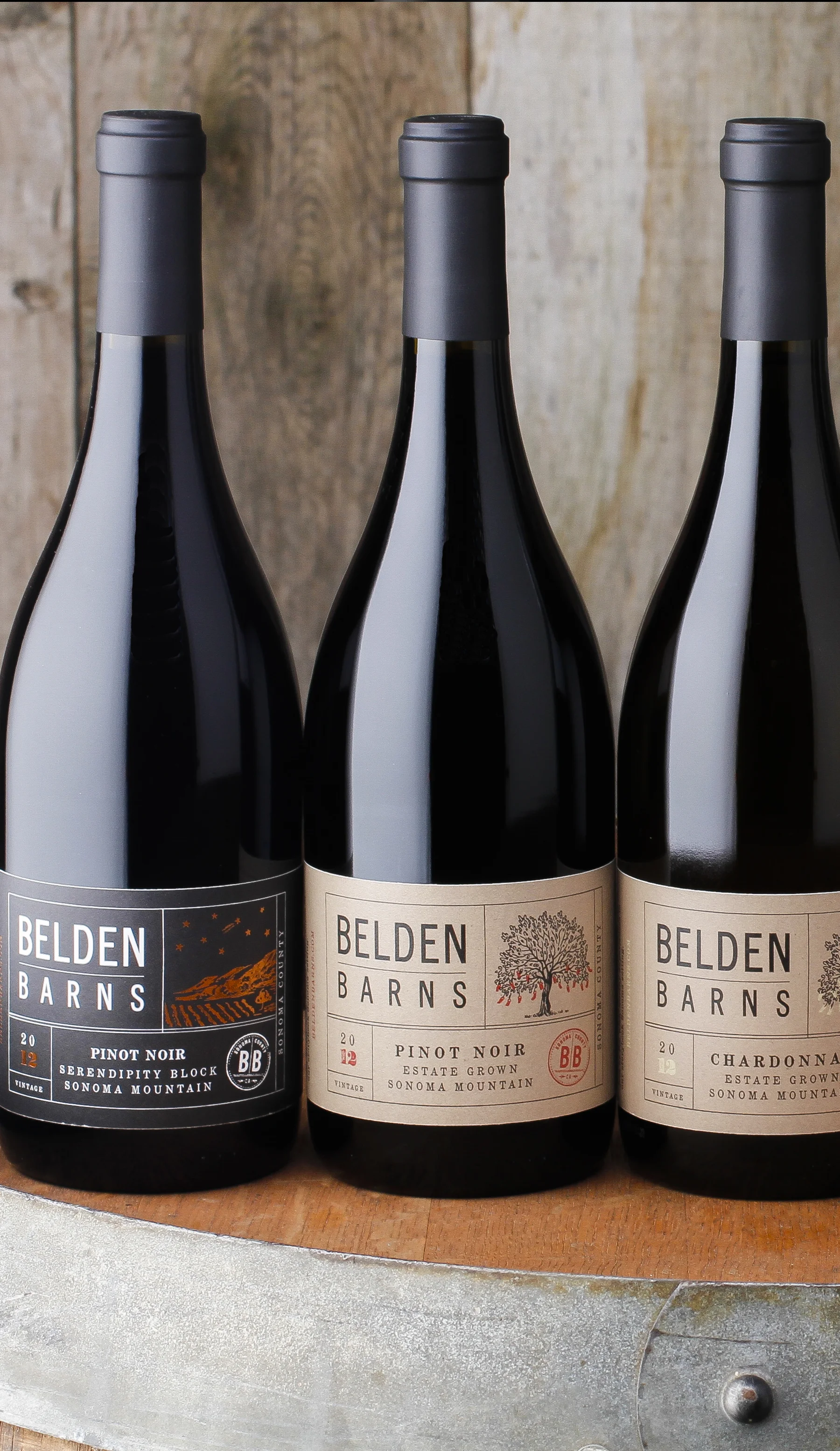
The breakthrough came from a defining moment in the founders’ history — their wedding reception.
At the celebration, guests were invited to tie handwritten wishes onto a “Tree of Wishes” using string and small red tags. The gesture symbolized hope, commitment, and shared belief in the couple’s future.
Those red tags became the foundation of the identity.
Each label features a symbolic tag — a visual nod to the founders’ wish realized through the vineyard itself. The system was printed on recyclable kraft paper, reinforcing the vineyard’s rustic elegance and commitment to authenticity.
The result was a tactile, story-driven packaging system rooted in meaning rather than decoration.
THE RESULT
Belden Barns launched with a distinctive, cohesive identity that set it apart within Sonoma’s competitive boutique wine landscape.
The brand’s packaging became an extension of its origin story — understated, personal, and unmistakably authentic.
A vineyard born from a wish.
A label built to tell it.