christopher mcgauran


THE STORY
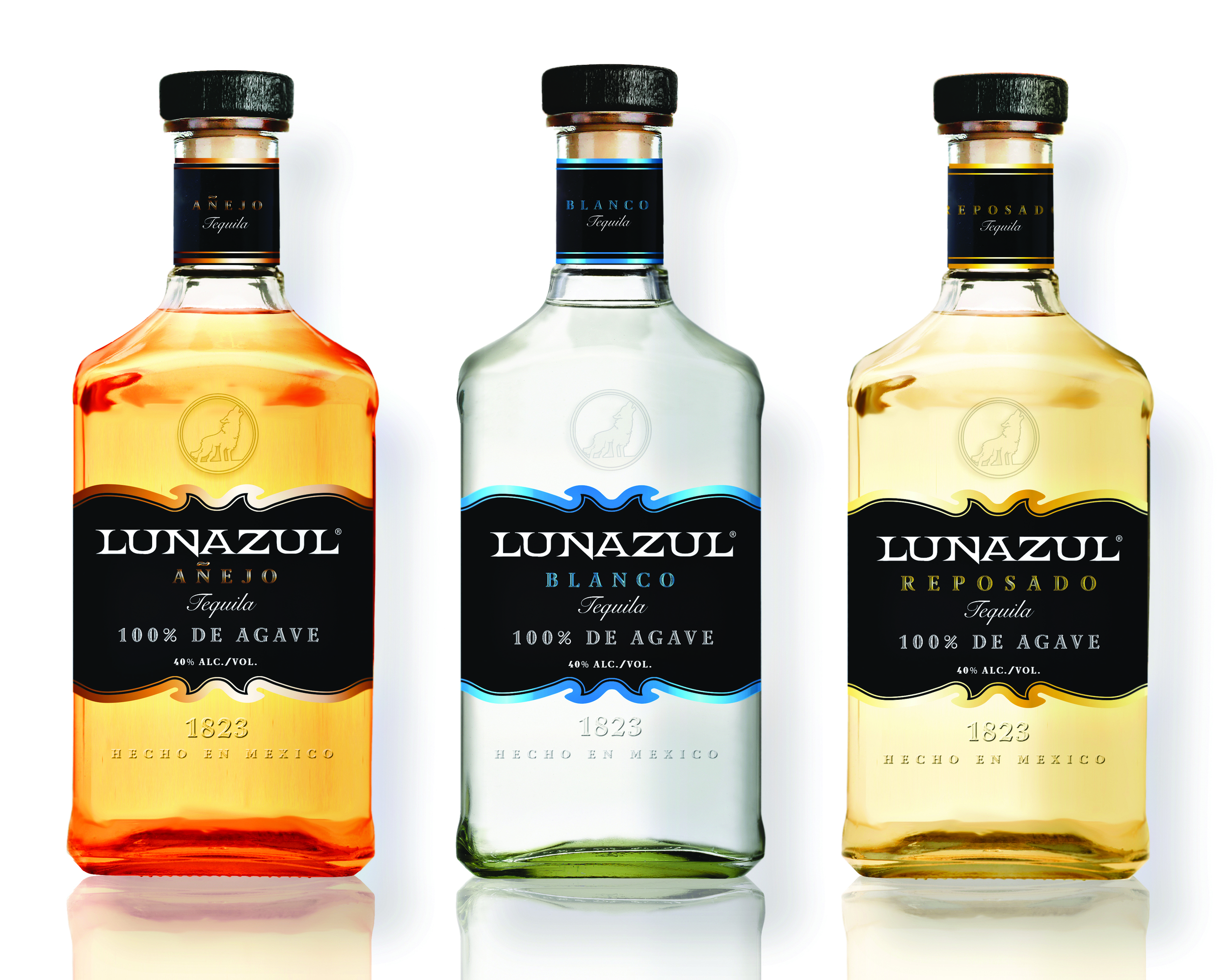
Lunazul Tequila needed an updated look for their regular line of tequilas and their premium tequilas.
THE CHALLENGE
Update the packaging to a more modern and contemporary look. The look must be more upscale but familiar to the target consumers as their favorite go-to tequila brand. In addition, do away with the current "biker sheik" feel of the current packaging. Create an entirely new label under the same direction for a new tequila brand "Double Barrel."
THE RESULT
WINNER - Packaging - “Lunazul Tequlia” - American Graphic Design Awards - 2015
Thinner more modern labels were introduced with familiar die cuts. Bottle shapes remained the same but the addition of blown in glass features, cork neckers, foils, and matted metalics gave it a more upscale feel while still containing a nod to the original packaging.
SCROLL DOWN ⬇︎
a. Existing main line packaging
b. Main line packaging update designs (currently in production for 2015 release)
c. Existing Premium line packaging
d. Premium line update designs (currently in production for 2015 release)